- Analyze a typographic composition designed by this typographer.
While Lissitzky didn’t design any typefaces, he had a revolutionary philosophy behind the use of text in designs—to use them not only to convey message, but to use them to enhance movement, weight, and structure just the same as other visual elements. Lissitzky called for designers to follow suit, to focus on “optics, not phonetics” (The Topology of Typography, El Lissitzky — Broadside, Glenn Goluska, 1983, n.d.). This philosophy of Lissitzky’s was foundational for those among the New Typography movement.
Below is the cover of Arkhitektura (Architecture) at Vkhutemas, the 1920 Russian state art and technical school (VKhUTEMAS (Higher State Artistic and Technical Workshops), n.d.), that Lissitzky designed. The word Vkhutemas is written once, horizontally; and the word Arkhitektura is written twice, vertically and diagonally. All of them intersect along the letter that looks like an English X, which represents their common phonetic, “kh.” The image in the background is one of a hand holding a compass at roughly a 45 degree angle.
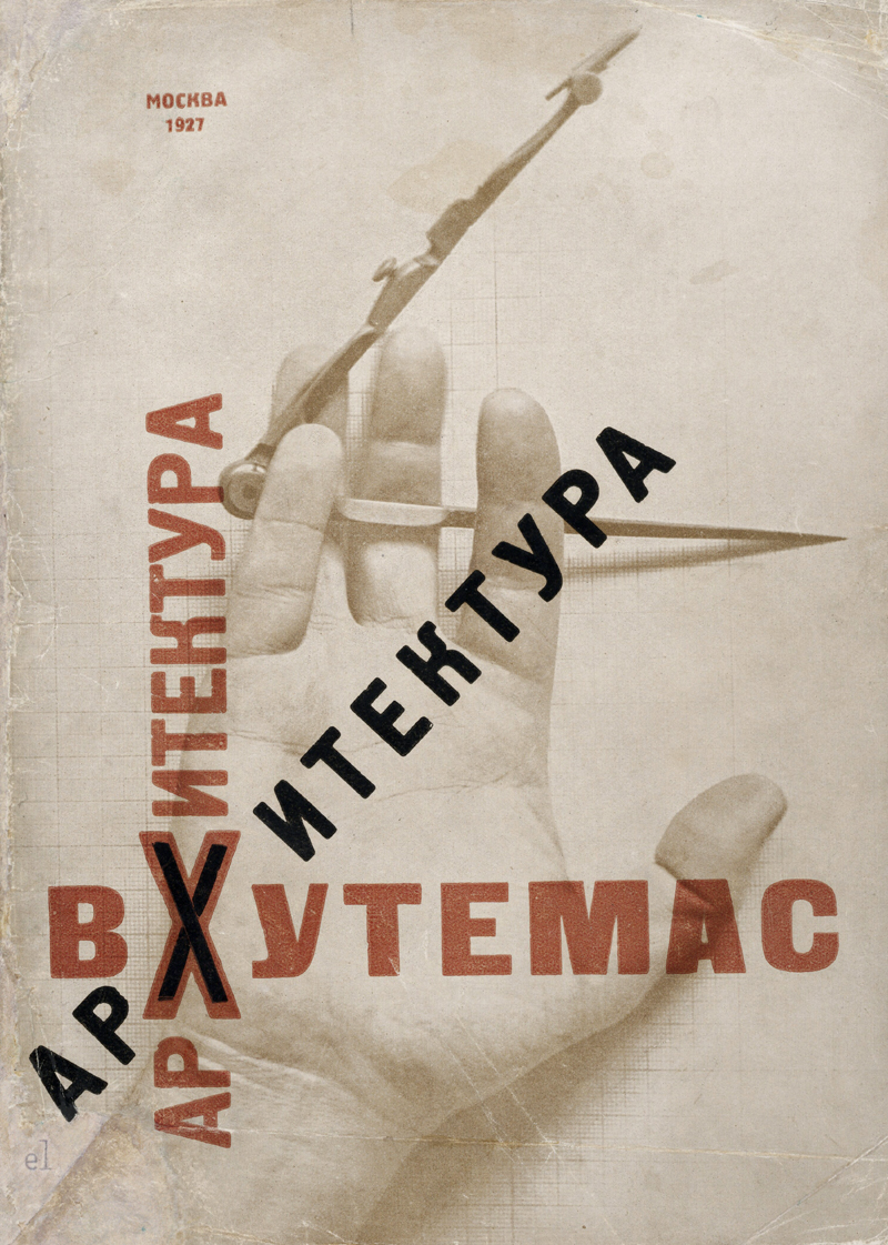
The horizontal leg of the compass aligns with the horizontally written Vkhutemas. Similarly, the diagonal arm of the compass aligns with the diagonal Arkhitektura, though this time, the forearm and thumb also align with these lines. Again, a similar alignment occurs with the vertical Arkhitectura, but this time with the vertical lines of the outer palm and index, middle, and ring fingers.
All of these alignments create visual intrigue and novelty that help to guide the viewer’s eye along the cover.